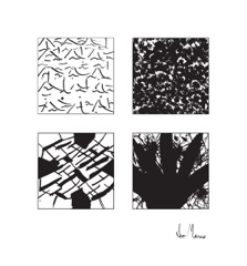
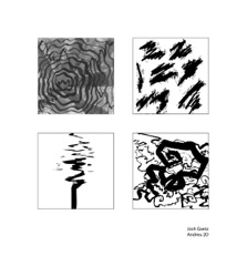
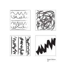
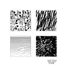
Jose Agustin Andreu
STUDENTS' WORK
2 Dimensional Design
#1-4 | #5-8
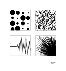
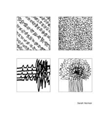
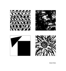
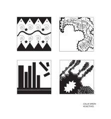
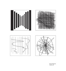
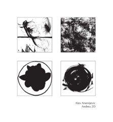
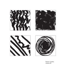
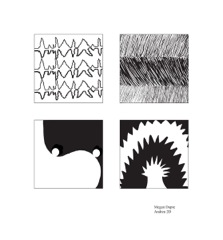
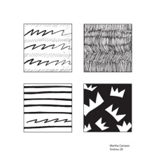
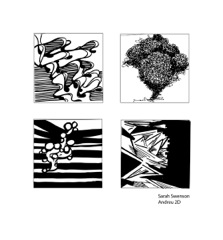
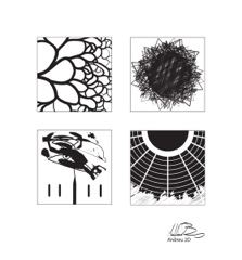
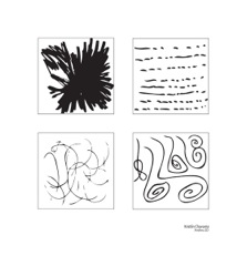
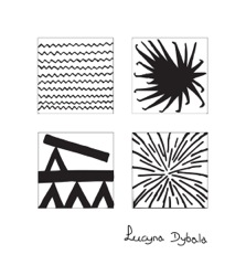
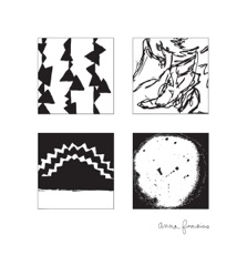
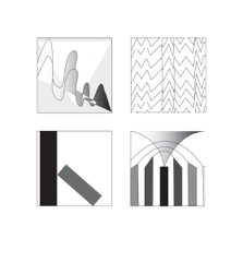
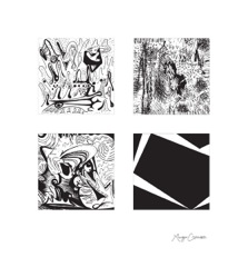
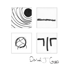
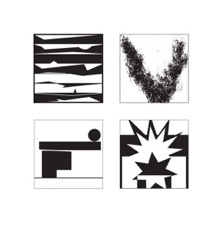
Adjectives 1-4
Click Image for Manual Slides
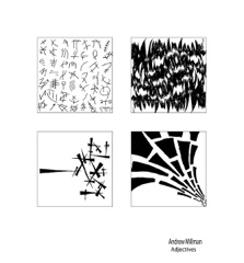
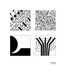
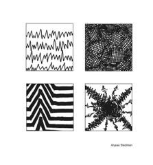
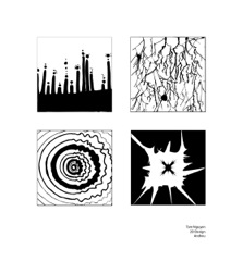
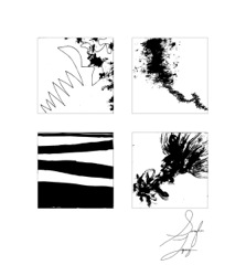
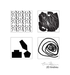
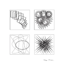
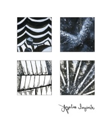
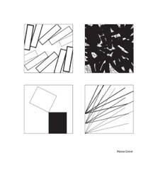
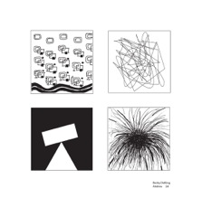
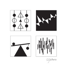
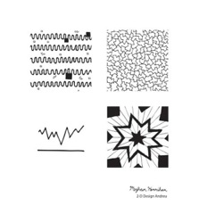
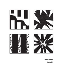
On tracing paper with pencil, make at least 6 to 9 thumbnail sketches of each adjective pair using the abstract/analogous method of representation. You are to depend only on the Principles of Design. No 3D illusions, no images, no symbols or words. Choose the best visual representation of each of the adjective pairs, consolidate and synthesize the idea and render with black marker and/or black ink each adjective pair on a 4" x 4" Bristol board.
1. hard – heavy
2. soft – light
3. immense – expansive
4. frail – delicate
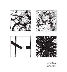
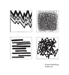
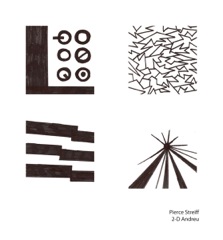
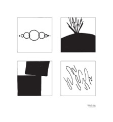
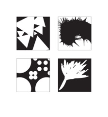
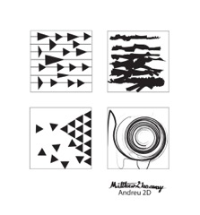
5. rhythm – variety
6. course – rough
7. stable – unstable
8. energetic – powerful
You can develop your representations using these elements:
• Points
• Lines, black on white space or white on black space, actual or implied
• 3 point or 3 line connections;
shapes can be curvilinear, rectilinear, empty, filled, open, closed, etc.
• Hexagons and/or circles
• Spirals or radials
• Branching patterns
• Meandering lines
When developing your drawing, consider the Primary Qualities. Your composition can be open or closed but it cannot extend physically beyond the frame. Be aware of the negative space/shape in the individual composition within each square.
Primary Qualities
• Number or quantity of elements
• Figure or shape of forms
• Magnitude or size relationships
• Position or placement and orientation on picture plane
• Motion or direction, actual or implied
The final appearance of your presentation is most important. Erase pencil guidelines.
Clean up black marker errors with Pro-white or white gouache. Do not title them. The idea should be conveyed visually and should be obvious. Write your name and the adjective pair title on the back of each 4" x 4" square.
Scan final developed tracings or finished Bristol drawings into the computer, Live Trace the images and Expand them. Make any adjustments deemed necessary and save into a file.
Place the eight designs on two laid-out art boards. Do not title them. The idea should be conveyed visually and should be obvious. They should be laid out on 14"x13" panels, from left to right in sequence in two rows and two columns, 1,2, and 3,4 on one panel and 5,6, and 7,8 on the other panel. The layout should have 2" margins at top and sides and 3" margin at bottom. Place your name in the middle left of the right margin.
#1-4 | #5-8


